To comply with my non-disclosure agreement, I have omitted and obfuscated confidential information in this case study.
THE CHALLENGE
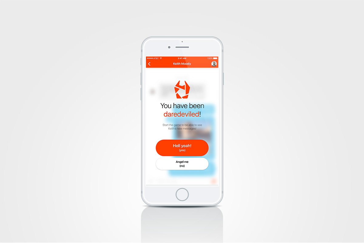
Our client approached us with two primary objectives: introducing gamification and increasing engagement (vs. competitor apps).
THE APPROACH
A Lean Approach
We opted for a lean approach which emphasizes rapid sketching, prototyping, user feedback and design mockups. This created early team‐wide alignment and arose a lot of great ideas.
Trust and transparency
This is part of the culture we shared in the team. We wanted to share our methods and thinking with the client, which helped build a strong relationship with the client.
Being on the same page
Meeting with the project owner helped us understand his vision and business challenges. We identified risks and aligned expectations, so we could all have a shared vision of the project.
MY ROLE
I was responsible for the user experience strategy, conducting the research, information architecture, wireframing, prototyping, visual design and interaction design of the iOS app. I was the only designer assigned for the project, producing all major deliverables and presenting them to the client.
THE PROCESS
Customer & Market Insights
In the first phase of the project I started analyzing the market and user's needs, pain points, behavior and motivation.
The discovery phase was an empathy driven process. The main research methods used were Customer Interviews and Surveys. I interviewed a representative group of all ages, both men and women, as well as from different social environments and with various emotional states towards dating networks.
Surveys gave me a broader overview, receiving answers from different countries, cultures and socio-economic background.
The results were summed up in Empathy Maps and Personas, which guided us throughout the whole project, validating decisions and helping with prioritization. I immersed the Personas in Storyboards for context and started gathering insights.
Problem Solving
I mixed the research results with the client's needs and started to write down solutions for the problems found. I compared existing solutions (based on Competitor Analysis) with the ones that I came up with in a Heuristic Review. A Feature Matrix helped us prioritize the features and ideas that we had as a team, and draw the line where the MVP would be well outlined, optimizing the time/money/value balance.
Strategy & Vision
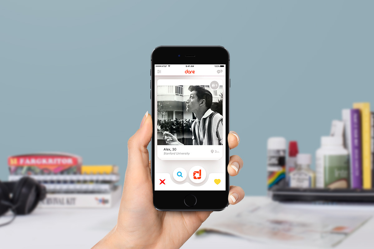
I created the wireframes that translated the solutions into a mobile interface in order to share the vision, content strategy and user flow. This helped to gain alignment and drive decision making.
Tools used: Mockplus
User Interface, Interaction Design & Prototyping
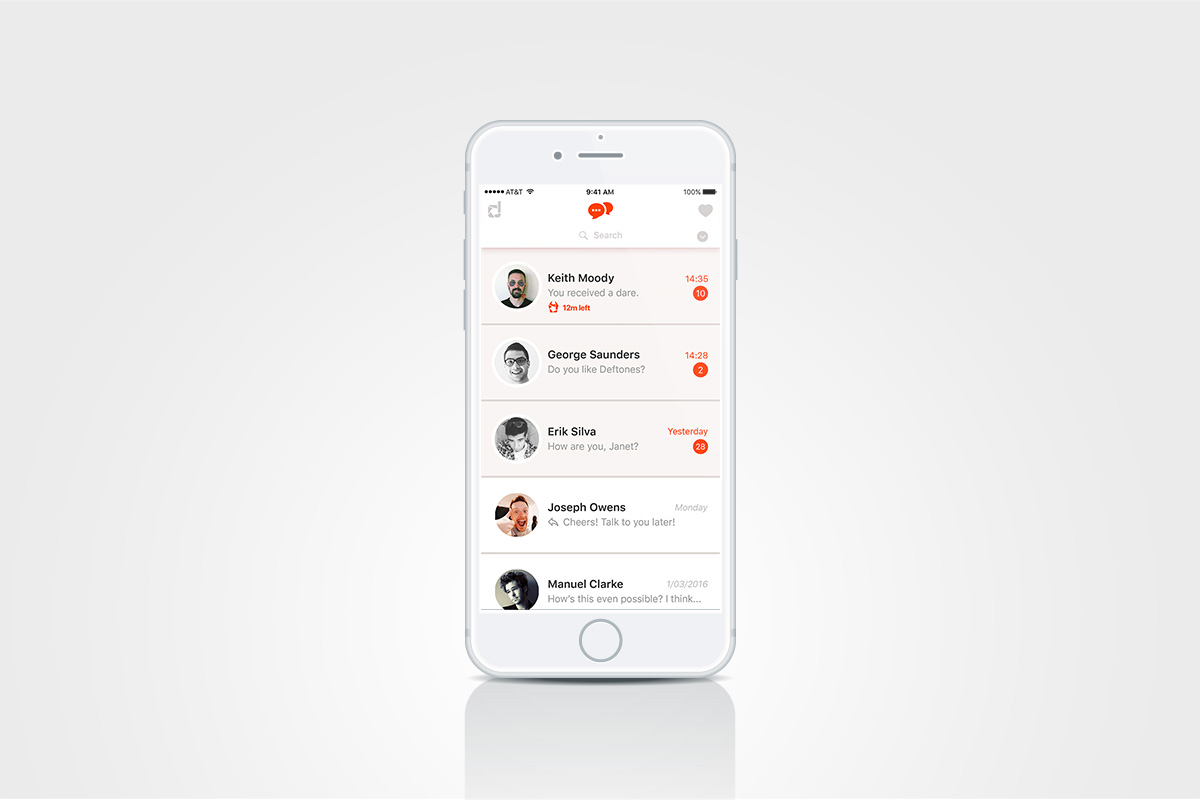
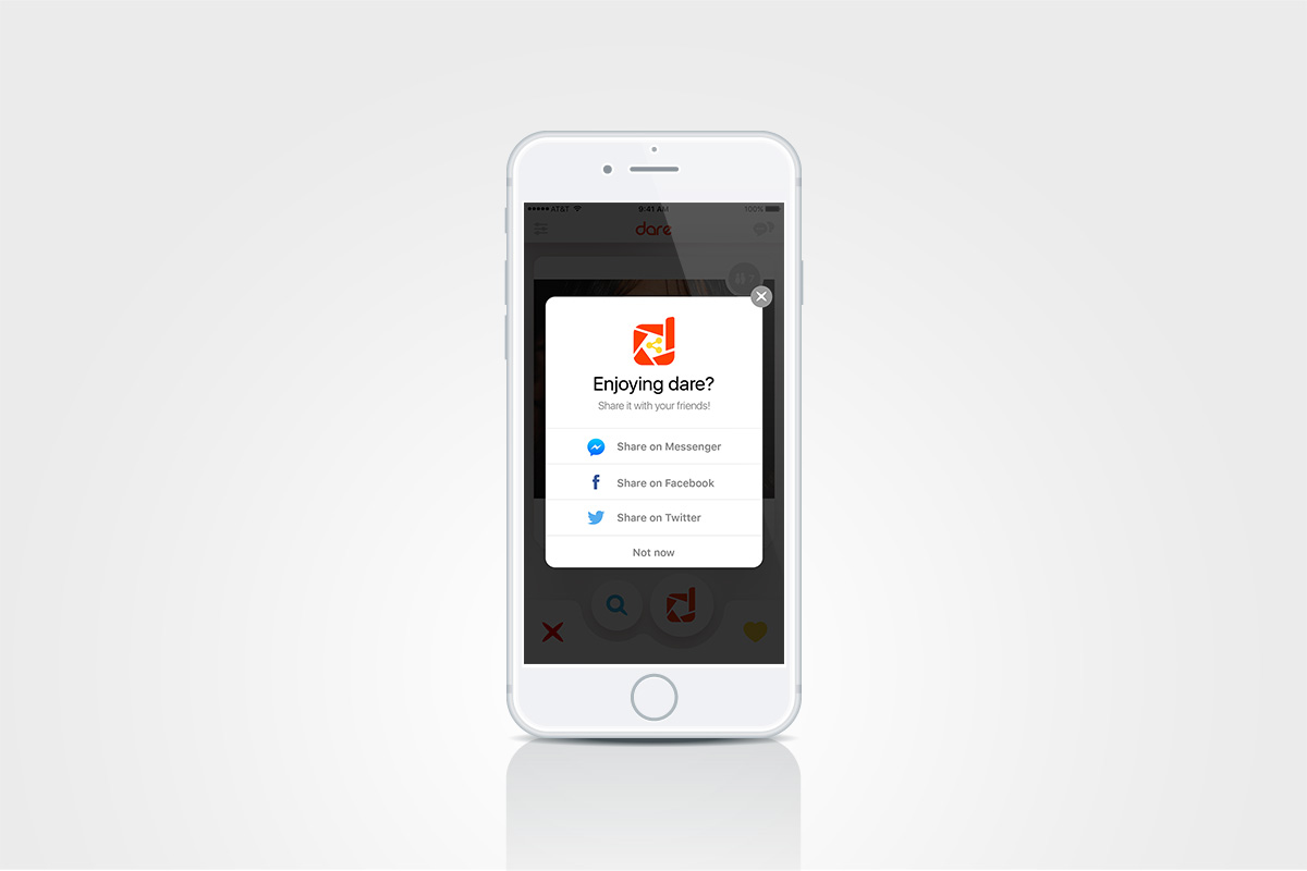
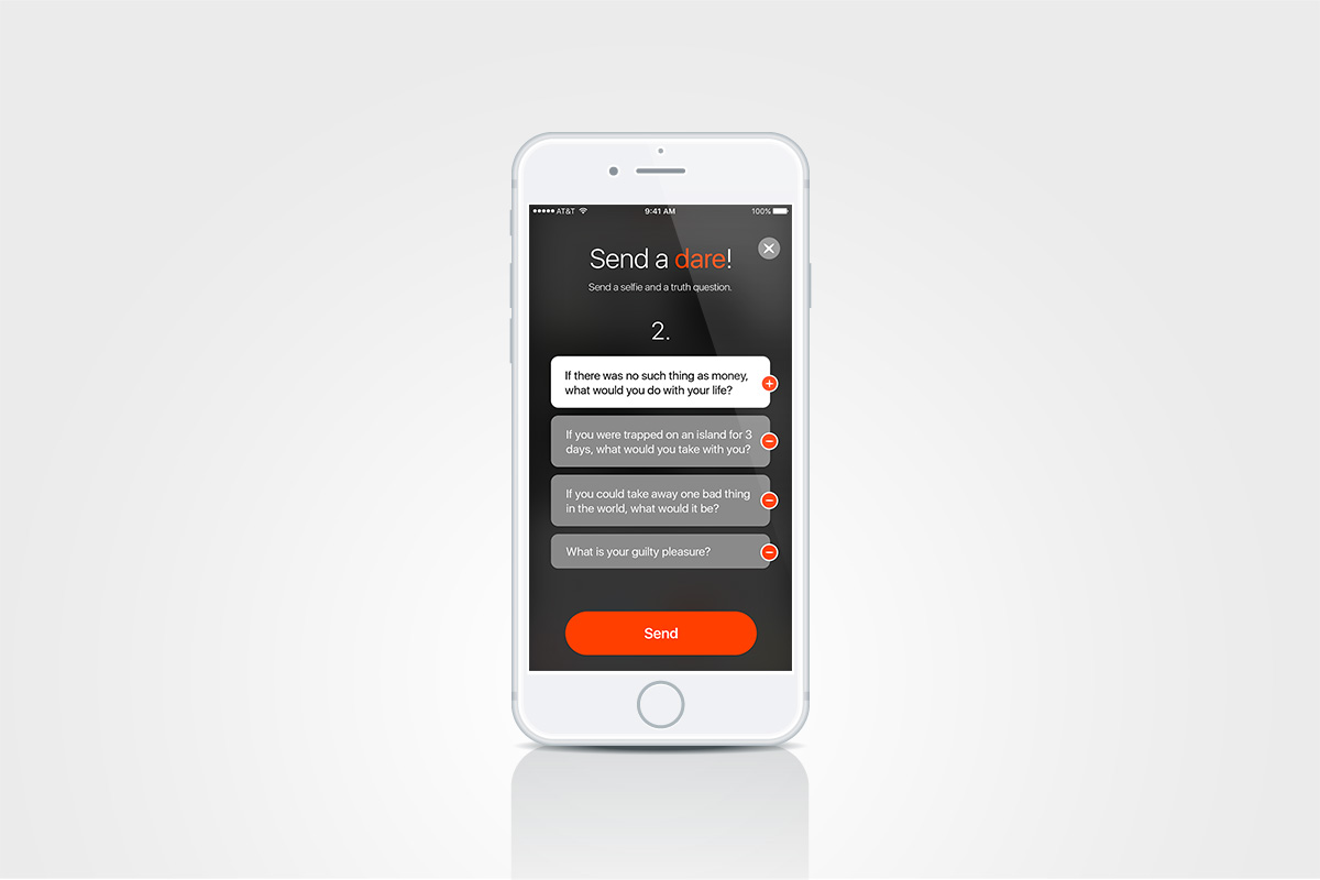
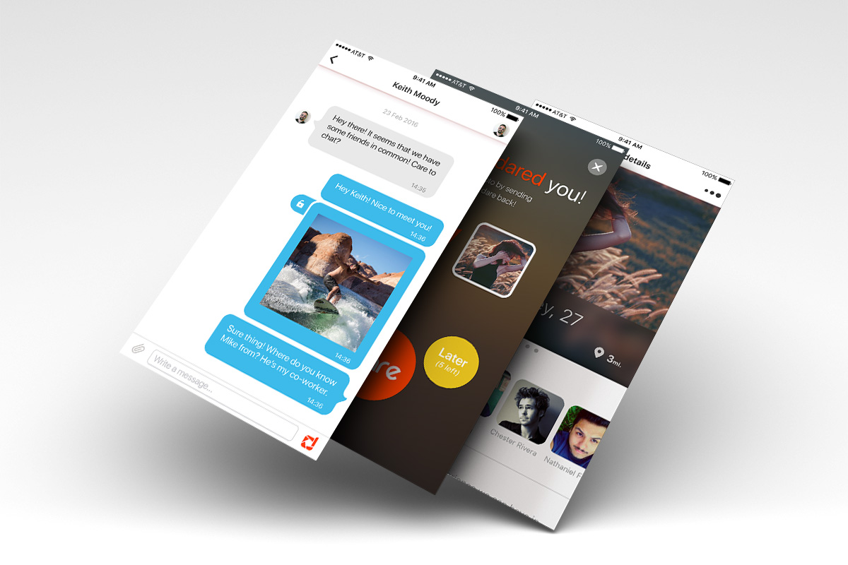
I created, based on the previous steps, mockups and a functional prototype. This helped us, as well as the testers, gain a good overview over the feel of the app. We were able to optimize the flow, discover unpredictable flaws that were easy to correct before the development process, and iterate towards a better version.
Tools used: Adobe Photoshop, InVision, Marvel, Principle
Testing
I conducted user tests during the Define phase, in which I created the wireframes and mockups, to be able to validate as early as possible the design decisions. But the most important tests were done using the functional prototype as a test 'app' for the persons I had interviewed at the beginning of the project. Based on a predefined list of tasks, accompanied by a set of questions, I broadened the list of validated decisions.
